Let's be honest: Most moving company logos look like they were designed 20 years ago.
And that's a problem, because your logo isn't just a billboard on wheels—it's your first chance to show customers you're worth premium rates.
Here’s where moving company logos go wrong:
❌ Boring trucks and boxes dominate the space
❌ Emphasize speed and muscle vs. reliability
❌ Designed to look good on a truck, not a screen
In this guide, we'll show you exactly what separates profitable moving brands from the ones stuck competing on price, starting with the very first thing customers see: your logo.
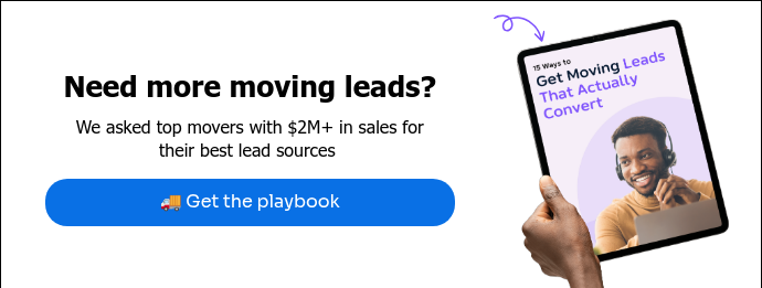
What's the secret sauce? CEO Allison Endicott shares why her brand turns heads—even at 70mph: Best Moving Branding 2025: Wirks’ Winning Formula.
Moving company logo design: 10 examples that nail it
Memorable design and profitable positioning—these guys got it right.
1. Good Greek Moving: a mascot with a mission
From Pringles to the Jacksonville Jaguars, brand mascots are a great way to punch up your logo. Good Greek's Spero the Hero assures customers they’re in capable hands. When quotes come in, who looks more professional: the guy with clipart or the moving superhero?

2. Wildcat Movers: standing out in a crowded market
Bold typography plus fierce mascot equals instant authority. Wildcat's black-on-chartreuse design tears through the noise and helps them own their market position. And the best part? Typeface choice can increase positive consumer responses by up to 13% 📈.

👉Here's how Wildcat’s owner makes more profit than companies 2X his size.
3. Moving Ahead Services: selling the full package
Three simple icons tell customers "we do it all." Moving Ahead's visual roadmap—box, mover, truck—instantly communicates full-service, helping them land bigger jobs and upsell additional services.

4. Let’s Get Moving: instant trust signals
Let's Get Moving's high contrast tape-and-pin design does double duty: grabs attention and signals professionalism. The result? Higher close rates on first-time calls because customers know they're dealing with a legit operation.

5. Wirks Moving & Storage: minimalism that works
Wirks' logo proves less is more with no images at all. This clean and friendly wordmark has enough pop to stand out from competitors, while helping attract premium clients who value professionalism over flash.

6. 2 College Brothers: colors that convert
If you want to be a scroll-stopper, take a page from 2 College Brothers' book. They built a brand that stands out in local search and gets customers clicking their estimates first. No trucks, no slogans—just smart design that converts leads and keeps their trucks full.

👉Here's how they scaled from startup to multi-state with profit margins at 30%.
7. Two Men and a Truck: ultra-memorable logo + tagline combo
Two Men and a Truck turned stick figures into a billion-dollar brand. Their hand-drawn style earns trust without looking cheap—which let's them charge premium rates in every market they enter.

8. Central Coast Moving: classic meets modern
Central Coast Moving shows what happens when you get your branding right. Their logo is bold and inviting with stars that practically guarantee great service.

👉Here's how Central Coast Moving grew 50% in one year.
9. Augusta Movers: authority that sells
Augusta Movers' action-hero silhouettes send one message: these guys mean business. Their no-nonsense design helps them command premium rates in a market full of budget operators.

10. True Friends: borrowing trust from man's best friend
True Friends' logo isn't just cute—it's genius. This design makes their brand promise "always there for you" is instantly believable. And who doesn't love a guy with his dog? 🐶 When five movers are bidding the same job, guess who wins?

5 logo rules for the win
You don't need a design degree to get your desired result: a moving service logo that helps you charge more and win better jobs.
1. Keep it simple (but not cheap)
Most moving logos try too hard. 95% of top brands stick to just two colors—any more and you look amateur. Think Two Men and a Truck: basic design, billion-dollar results.
2. Show you're worth premium rates
Your logo is your first quote. If it looks budget, customers expect budget pricing. Use professional design elements—remember, just changing your font can boost response rates by 13%.
3. Stand out in search results
Tiny truck icons disappear in Google results. Build something that pops on phones and tablets where 80% of your customers first see you. Test it at multiple sizes before you commit.
4. Make it work everywhere
Your logo needs to look premium across all formats—svg, png, jpg, pdf, and print. From postcards and mailers to moving truck wraps, consistent quality signals consistent service.
5. Be more than a mover
Don't just show what you do—show why you're better. Like MiniMoves, whose globe logo instantly tells customers "we handle small moves anywhere." That's not just branding, that's targeted lead generation. 🎯
Logo maker vs. professional designer: which one should you choose?
When you're scaling your moving business, a stock logo won't cut it. You need something that helps you charge premium rates—not something that screams "budget operation."
The DIY route (when you're just starting)
If you're bootstrapping, a customizable logo template is a great place to start:
The pro route (when you're ready to scale)
According to Wix, here's what quality costs:
- New designer (< 3 years): $20-35/hour
- Solid pro (3-5 years): $35-50/hour
- Industry veteran (5+ years): $50-150/hour
Find them on LinkedIn, Upwork, or Fiverr—but remember: a vector-based, professional logo that works across social media isn't an expense, it's an investment in higher rates and better clients.
Your moving logo matters more than you think
Your logo is either working for you—or against you. The companies we featured didn't stop at pretty designs. They built effective visuals to help them...
✅ Close more premium jobs
✅ Command higher rates
✅ Scale beyond their local markets
✅ Build instant trust with new customers
Now let's put that logo to work. Make sure your brand shows up everywhere your leads are.👇